Plates 6 and 7 woohoo!

Plate 6, red violet

This plate is primarily made using a stencil and the spray splatter technique.  I really like this and can see how I can refine the idea even further in future prints, but gradually increasing or decreasing the size of the opening as I continue to add spatter .  It would be a little like Stephen McClelland’s technique of doing a graduated “creeping” etch in his aquatints.  Just a little.

While I like this image as it is now, I really like having the strong contrast of  a black key plate.  In this case, I added a small amount of purple into the black ink, to temper it a little.

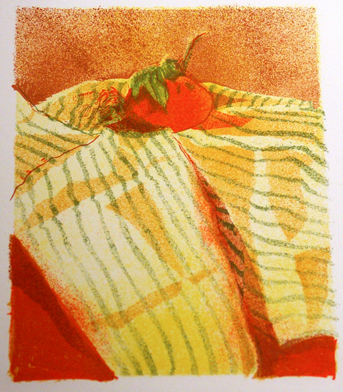
The final print "One of Many" 7 plate lithograph Anne Belov 2011

I will probably add a few layers of monotype to the print (as I can rarely leave well enough alone) but I won’t do this for 4 or 5 days, as I like to give the black ink time to dry.  I did add a small amount of cobalt drier so that it will not take too long.  I really like Graphic Chemical’s Shop Mix Black as it is a really deep, rich black, but it does take a while to dry.

I will set these posts up as a page , so that the sequence is in order and it will stay on the site for a while.  Look for it soon.

Plate #5 Burnt Sienna, 5th layer of print

plate 5 This is the fifth plate that was printed.  The ink is a semi transparent burnt sienna.  You can see how it’s all starting to line up, except of course where it doesn’t.  I usually wait till I’m completely done printing all the plates to see where I need to fix it.  As we like to say, you can always fix it in the hand coloring, but it’s best if the adjustments are small.  I think I mentioned that after I print the 2nd plate, instead of lining up the plate face up on the registration template, and placing the paper face down (also lined up on the registration grid) I put the paper face up and then lower the plate face down onto the print.  This way I can make tiny shifts in the plates position to get things to line up within the print.  It’s great when it works, nerve wracking when it doesn’t.  I make attempts to leave a little “wiggle room” when I design and make the plates, so that I have 1/16 to 1/8 inch of slack in my positioning.

Originally I was thinking to print this plate as blue, but then changed my mind to keep the colors in a more narrow range.  The next plate is purple and so things will start to sharpen up.  The last plate, which I will print in black will theoretically snap it all into focus.  we shall see.

The next 2 plates of this as yet, un-named print

drawing

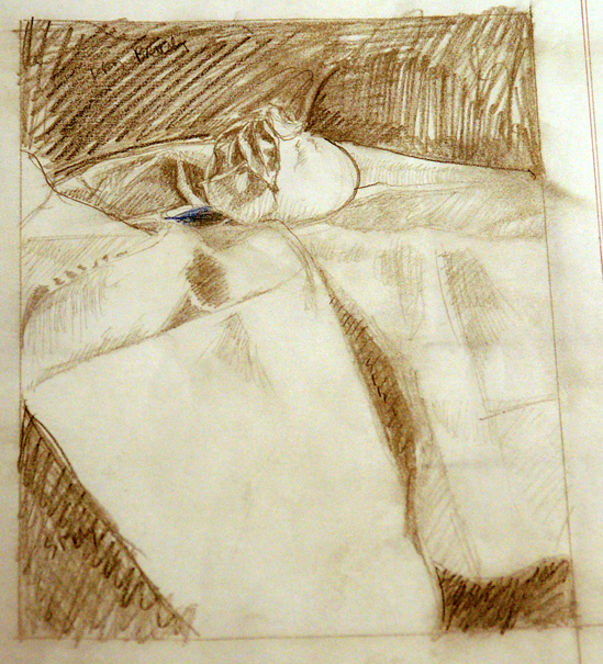
original pencil drawing

I always start out doing a reasonably detailed drawing before starting a print.  I used to do my drawing on opaque paper, trusting that when the image was flipped (as it is when you make a plate based print) but my trust was not usually fulfilled.  Not only do our eyes tend to like a composition weighted more to one side  (I believe towards the left) than the other, lines that you think are vertical in one direction turn out not to be when they are flipped.  So, I started doing my drawings on drafting vellum, so that I could use a light table and place the translucent polymer plates on them to paint on each plate.  I can then do my key plate and stack other plates one on top of another (up to 3 at a time)  so that the plates will be registered to one another. To keep the plates in place, I use stick on “photo corners” (1~ 1/4″ size) to hold the plates in place.  Registration is important if you are working on multiple plates, or a planning to add monotype layers to your print, particularly for representational images.

registration template

This is an example of the printing registration templates I make in order to have everything line up properly on the paper.  The plate rests face up on the inner marks and the paper is placed face down over the inked up plate lining up with the outer marks.  The whole shebang goes through my Takach Etching press at firm, but not intense, pressure.

Here are the resulting printings from plates 3 (green) and 4 (red-orange).

3rd layer of printing (green)

4th layer of printing

One more plate tomorrow (of 7 plates, total)

See Me Demonstrate the New Mini-Halfwood Press!

Last Saturday I got to play with and demonstrate Buffy Cribbs’ new Minerva Mini- Halfwood Press, that she built under the guidance of Bill Ritchie, who is the developer of the press.  It’s really another part of the printmaking revolution that’s been happening around the world of printmaking.  Bill, who was a professor at the UW where I went to graduate school…um…let’s just say a while ago…developed this press as an alternative to the 600 lb. monsters that many printmakers (myself included) own and create hand pulled prints on.  Don’t get me wrong… I love my press.  It’s a 30″x60″ Takach table top press, made right here in the US of A by people who are so sure of their product that they give it  a 20 year warranty.  I can do larger monoprints and etchings on it.

Gail Gwinn introduced me to the “mini” and she also has a larger press.  There are a number of small presses out there, and I’m not going to mention them by name, because mostly they are not worth half the price.  A few of the excellent press makers do make smaller models, but they are still really studio models, meaning you can’t easily take them on the road to teach or do demonstrations.  The mini is easily picked up and carted around, and pulls excellent prints.  They are not cheap, but when was any good quality art producing product, from brushes to easels to presses, inexpensive?  I’ve posted a link to a video Bill made of me demonstrating the press last weekend, and there is already a link to Gail Gwinn’s wordpress blog where she has more info about her mini.

Here’s a link to Buffy Cribb’s website if you decide you can’t live without your own Mini Halfwood. Her model is called the Minerva, and uses the same metal assembly that Bill uses on his press, and is created with his blessing. (after all, he might want to retire sooner or later.) http//www.cribbsmorrow.com